Is Your Site Ranking after Google’s Mobile Friendly Update?

Today (April 21, 2015), Google launched an update to its search algorithm, which gives preference to mobile friendly sites for searches made on phones, tablets, and other screen sizes. Many websites already cater to mobile devices through responsive design and mobile-specific themes, however the rest of the less responsive websites indexed by Google should now expect to drop in search results for Google’s mobile rankings.
Desktop vs. Mobile Traffic: Evolving Trends
One of the big pushes behind this search algorithm change is the shift in website and search traffic. We are viewing websites on more than just our computer screens. This trend can be seen in Mentor Works’ website traffic. Over the last 12 months, mobile traffic as a percentage of overall traffic has more than doubled. The Internet is being integrated into just about everything – from phones to televisions to watches – in a movement called the Internet of Things (IoT), and Google is ensuring that the user experience evolves with the technology.
Testing Your Site’s Mobile Friendliness
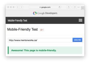 To test if your current website is mobile friendly, Google has created a “Mobile-Friendly Test” website.
All you need to do is input your website and press “ANALYZE” and you will receive feedback on your website’s mobile friendliness and any necessary steps you need to take in order to improve its screen adaptability.
Google also has a number of other tools that can help you determine if your site is optimized for multiple screen sizes, including Google Webmaster Tools previously mentioned Google GoMo, which provides resources, preferred partners, and other information on this mobile revolution.
Taking Advantage of Google’s Mobile Friendly Update
Some publications and industry journalists have called Google’s update “Mobilegeddon”. The negative connotations with it are only justifiable if website administrators aren’t willing to take advantage of the benefits of a mobile friendly site. By upgrading your website to a responsive design or mobile-skinned theme, you will now outrank your competition and provide a better user experience for your readers. The benefits are there; your business just needs to evolve with the market trends to stay competitive.
Welcome to the New Mentor Works Website
You may have noticed a recent change to our website. We are committed to ensuring that whether you are on a tablet, phone, or big screen, Canadian government funding resources are available and easy to navigate. That is why we have adopted a responsive design that serves up content in an optimized format for your device. We have also added new free funding resources and have big plans to add even more in the coming months! We hope you like the new look!